When building a website, one of the most important aspects of your page is its appearance. The way a website looks can vastly impact its impression upon your potential customers. Research shows that humans absorb visual cues much quicker than anything else, so you want to make sure that you create a good, lasting impression.
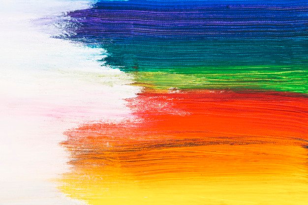
Above all else, the colours you use on your brand’s website will be one of the first things your audience notices and creates opinions on, whether they know it or not. Colours can enhance any basic website, when used skillfully. Too much colour may overwhelm visitors, while too little may bore them. Colours can also affect people’s moods, which of course, may influence your sales.
Because colours are so closely linked with emotions, we will give you a breakdown of what moods, familiar objects and brands each is associated with, and some tips on how and when to incorporate the colour into the design of your website.

For instance, red is a colour which can often signify either anger, danger, or love. Depending on its use, your purpose, and the product, you may want to think carefully before using this colour on your website.
Some common examples of red items in nature and the world are stop signs and traffic lights, roses, and many types of fruit.
A few well-known brands that use a fair amount of red in their logos are McDonalds, Wendy’s, Coca-cola, H&M, Disney, Netflix, Levi’s, and Budweiser.
Red is heavily associated with holidays like Christmas or Valentine’s Day, so it’s connotation is not entirely negative. However, too much of a vibrant red may cause some discomfort to visitors of your site, so be weary of this.
As a primary colour, red is a popular choice of colour. However, it has a tendency to clash with other colours, so keep that in mind if you plan on using red on your website. Bright reds can instill strong emotions, while more muted reds can add a fun, but tasteful pop of colour, with a less visceral effect on the mood of your customer.
Blue is the second colour in the primary colour wheel, and it is most notably associated with sadness. However, blue can also be calming, and represent trust, security, and stability.
Blue is frequently seen in nature, being the colour of the sea and sky.
The colour can be seen in logos for brands like Pepsi, Samsung, Facebook, Twitter, Ford, LinkedIn, Gap, and more. It is a popular colour for branding, which goes to show that, despite being the token colour of sadness, it has significance beyond that in the marketing world. Many banks tend to be associated with the colour, harkening back to its symbolism of trust and security.
Blue is very easy on the eyes, and even when used in excess, can appear professional and appealing. When used in combination with other colours, it can clash quite a bit, so be mindful of what looks good with this colour. Yellow and green look the best with blue.
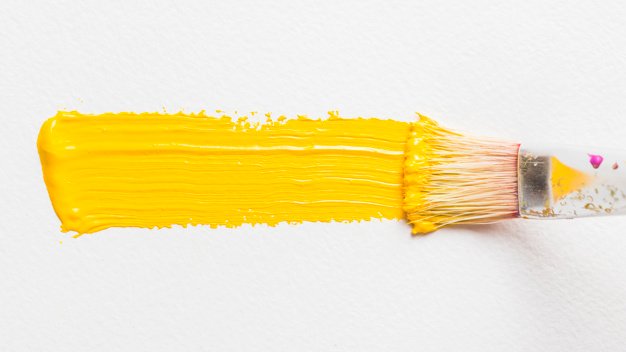
Yellow is the final colour in the primary colour wheel, and the most cheerful by far. Yellow commonly symbolizes optimism, youthfulness, joy and excitement, but it can also be a common symbol of caution, due to it’s eye-catching vibrancy. However, it is most regularly seen in a positive light, so unless it is blatantly clear that it is some sort of warning, it will most likely represent good feelings to its audience.
Using yellow on your website is a good way to catch your customers’ attention, or to elicit excitement and happiness, which may make them more likely to buy your product.
Some brands that include yellow in their logos are McDonalds, YellowPages, Best Buy, Nikon, and IKEA.
Yellow is commonly thought to be too bright to stand alone, so pairing it with a secondary colour, or using it in small amounts is likely the best approach with this colour. You want to incite happiness, but not drive off visitors to your site.
Brown is an earthy tone that often represents comfort and sensibility. Additionally, it is a neutral colour, which means it often goes well with most colour schemes.
Brown is the colour of dirt, trees, coffee, chocolate, and many of our favourite things.
Brands such as UPS, Hershey’s, M&Ms, and Louis Vuitton use brown in their logos.
Brown adds a homely, comforting charm. Incorporating this colour into your website will give your customers a sense of peace and security. Brown is often thought of as a simple colour, but that’s not a bad thing! It can add a little more flair to minimalistic designs, and create a safe niche, which your customers will associate with your brand over time.

Similarly, green is another natural, earth-tone colour. Green signifies nature, health, peace, and wealth, among other things. Green promotes relaxation and goodness.
Green often represents other positives, such as green traffic lights, and environmentally friendly products or brands. Green is the colour of most plant life, which is why it is commonly associated with environmentally-friendly products as well.
Green is used frequently in brand logos. Some of the most recognizable include Starbucks, John Deere, Subway, Spotify, Roots, TD, and Monster Energy.
Green is the easiest colour on the eye, and is the second most favoured colour by both genders. If you are looking for an uplifting design that will appeal to the majority of consumers, green is the way to go! This colour is versatile, and can accomplish nearly anything you want.
Orange is seen as a friendly sort of mid-ground colour. Somewhere between red and yellow, it can make people feel energized, enthusiastic, and creative.
Orange is another commonly occurring colour in nature. Many animals and foods are orange. It is also used for traffic cones, and other items intended to get people’s attention.
Fanta, Harley Davidson, SoundCloud, Nickelodeon, and Home Depot make use of orange in their logos.
Orange tends to promote people to act. This could be a good choice of colour for ecommerce buttons to add items to a cart or checkout. The colour tends to attract impulse shoppers. So, if online sales are your thing, you’ll want to include this colour on your website.
Pink is mostly associated with femininity, innocence, fertility, and romance.
In nature, pink is associated with beautiful exotic plants and animals. In society, it can be found in most “girly” items.
Brands such as Barbie, Cosmopolitan, Victoria’s Secret, and Hello Kitty are fond of the colour pink.
Because of its strong ties to gender, this colour may be best if you know that the majority of your target audience is female.
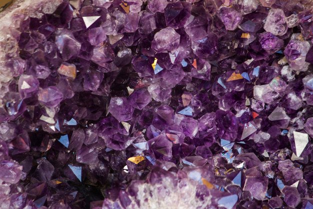
Purple is a colour that is associated with passion, royalty, and luxury. If you want your product to appear more elegant and expensive, purple is the go-to.
Purple is not seen too frequently in day-to-day life, making the elegance of this colour evident.
Purple is used in the logos of Cadbury, Hallmark, Yahoo, Taco Bell, and many skincare brands.
Purple is rich and sensual, but it comes with certain expectations of quality and service. If your aim is to make customers feel pampered, a dash of purple on your website will help you achieve this.
There are also some neutral shades which don’t quite fit into the same criteria as the colours listed. These tones, while basic, provide excellent foundations and accents for websites, as well as create unity and balance.
White is the most common colour for website backgrounds, as it creates the perfect base for most text, and visual content.
Colours pop against a white background, undoubtedly, but too much white space can bore viewers.
Black of course, is easy to spot against bright colours. It can outline, or accentuate things that you might want your customers to notice. It is the most common colour for fonts, as it is usually very clear to see. Most designers use black sparingly, as it is a dominant shade. Unless you wish to create a website with a dark theme, this is the best advice for using black. Too much can make your content harder to see, or scare off customers.
In terms of excitement, grey is certainly not the colour that comes to mind. However, it is an excellent neutral tone which can help to balance out other colours, or act as a softer, lighter substitute for black. Grey can help to create a more serene atmosphere.
Many articles online will coach you on the perfect colours, coordinating colour palettes, and so on. We will not do that today. We believe that the choice should be yours, and you can make your own educated decisions now that you understand more about colour in marketing.